Let me see if I can describe your nonprofit organization’s website without looking:
- You have a lovely image that runs across the top of the page — someone smiling, or a group of people who look happy. Or earnest. Perhaps you went earnest with the image.
- Your logo, of course.
- Then a statement about why you exist or what critical issue you work to solve.
- A conveniently located donation button. Just to the right. In red or blue, so it stands out.
Was I close? Three out of four? All of them?
Here’s the thing about being formulaic. It’s predictable. It’s unimaginative. And the worst of all, it makes you invisible. None of these are qualities you want associated with your non-profit brand. Predictable, unimaginative, invisible organizations do not solve the world’s problems.
Yes, that style is safe and looks like every other organization out there. That’s fine if you are a mega-million dollar non-profit, resting on your proverbial laurels. But chances are incredibly good that you are not. More likely, you’re one of a thousand small bootstrap organizations that works on a targeted societal problem. Funding concerns keep you awake at night. You have to stand out to survive, much less thrive.
Why have a website in the first place? Why use social media? To differentiate yourself so you can win and keep donors and supporters and funders and advocates.
You can do worse than the status quo, of course. You could have a copy-heavy website that makes it look like your site was designed back when AOL still ruled the Internet. Or you could have a collage of images. (If you have both, I may show up on your doorstep to do an intervention.)
Heavy copy on your Home Page or in the About Us section means you are probably trying to explain the entire workings of your organization … on one page. I will save you the effort. If you have more than three staff members, it can’t be done.
Let’s begin with a few assumptions:
1. Your donors and potential donors are really interested in understanding the mission of your organization.
2. They are emotionally connected to that mission, or they wouldn’t be checking you out.
3. They understand that solving the problem is complicated, nuanced, multilayered and will take time, so don’t tell them that. They already know.
4. They might want to know the highlights of your work, but here’s what they really care about: This problem is solvable, and you are helping to solve it. (Don’t skip over the first part of that statement. People don’t donate to the unsolvable problem. They turn away.)
This is the great balancing act of optimism and urgency. You want them to know that a lot of thoughtful, valuable work has been done, but also that you’ll need their support—particularly their financial support—to ultimately solve the problem. More money means more gets done. More hands-on-deck means more gets done. That is your call to arms.
Here’s what your communication should say, in a nutshell:
- This is what the issue is and here’s why it’s urgent to intervene.
- This is how you, the visitor to my website, can help.
- This is the impact we are making and can continue to make, together.
They don’t have to be in that order. But that’s what people want: simple questions, simple answers.
What does this look like for a non-profit? Here are four examples of simple, unique, optimistic, yet urgent front-page messages:
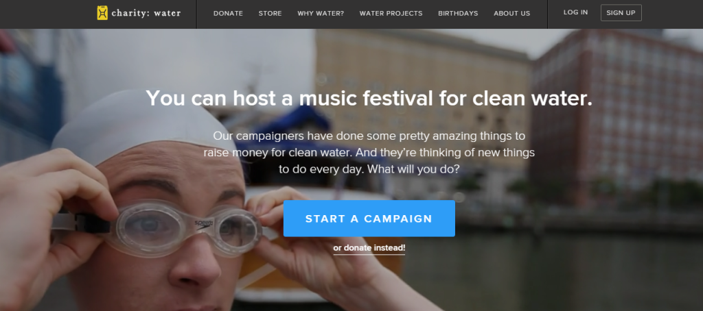 You have to visit this site to fully appreciate it. The top section is scrolling short video clips that show the different ways to get involved. This is one of the most creative, engaging and optimistic openings on a non-profit website out there.
Charity:water breaks down “the ask” into three simple steps, with short points that hit on the key things potential donors want to know before they contribute: the why, the how and the impact.
The organization asks visitors to get involved before they ask them to donate. Brilliant.
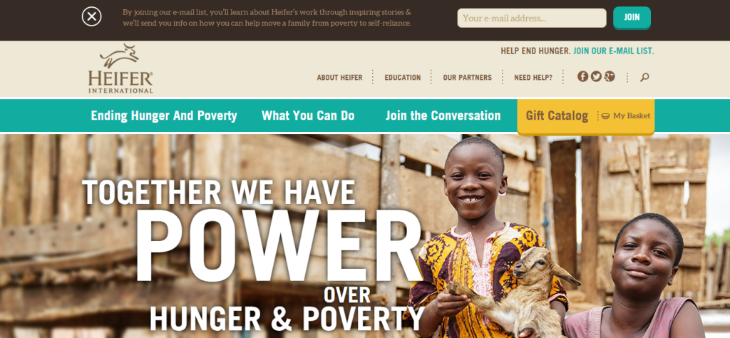 Their opening position is an audacious stake in the ground: Not one, but two, of the biggest blights on humanity (hunger and poverty) can be solved. Look at the language in their header. It isn’t what they are doing; it’s what you, the reader, can do. It asks you to add your voice: Join the conversation.
It’s the language of empowerment. People who are empowered are more likely to act.
3. 96 Elephants
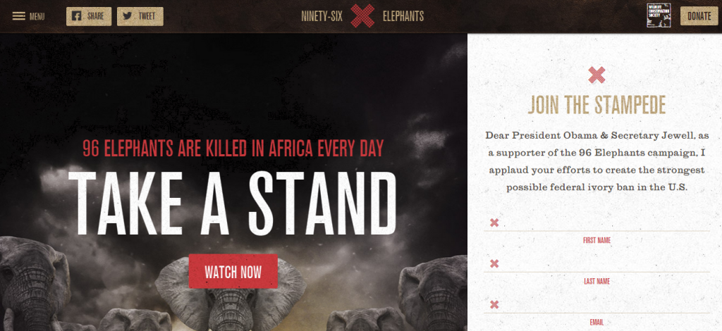 This is about as in-your-face as you can get. One call-to-action right up front: Sign on.
The “why” is one sentence. The “how” is one sentence. There’s a strong use of visuals, with good use of the front page space (below the scroll) to pull you through the stories quickly so you can get to your specific area of interest, without the use of the tired tabs at the top.
My only quibble with the site is that they bury the positive impact. And they have a great idea, which is also buried — taking an “elphie” to protect elephants.”
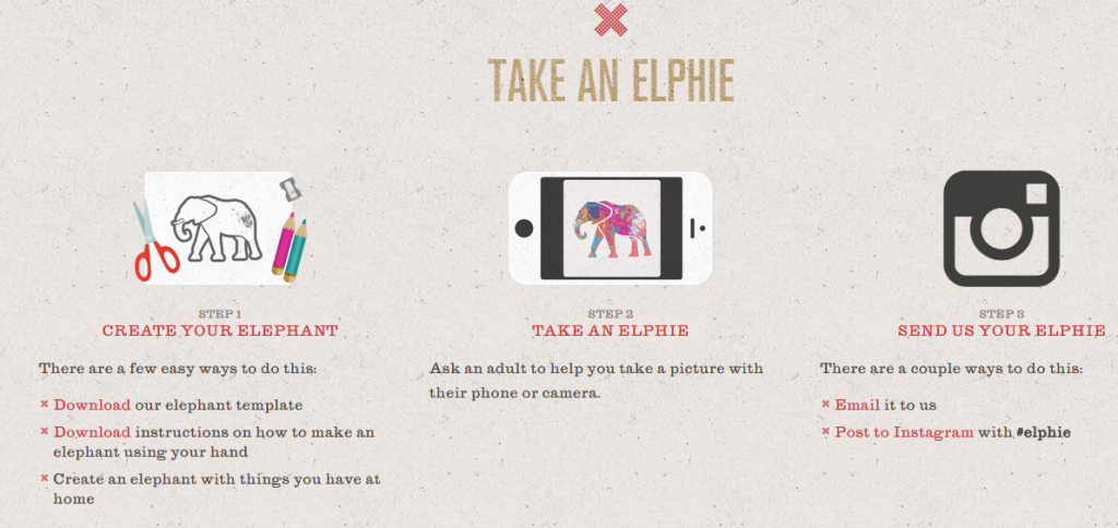 This idea is all sorts of awesome and should be front and center. And they should be asking people to post it on Twitter and Facebook to spread the news of their existence as an organization.
4. PAWS Chicago
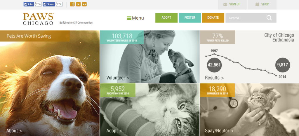 This one sets up a nice grid of impact. It’s always easier to pull people in when you have cute pups and kittens on your front page. But still, the driver on this is the stats. Nice, simple, impactful. Their buttons above are the “how.” And the upper right module is the “why it is urgent.” It’s hard to keep positive when the thing you are fighting against is death, but that simple line graph keeps it positive.
These are four great examples of how to break through the vanilla-ness one typically finds on non-profit websites, but without compromising or overwhelming the message. Feel free to send us more examples of sites that do this. Hopefully, one of them is your own.
